Favorites | #friezeweek Los Angeles
A truly LA event would not be complete without its hashtag and a round-up of #friezeweek wouldn’t be complete with beginning with our picks from Frieze itself. It was a big weekend of art-going and we saw some knockout work.
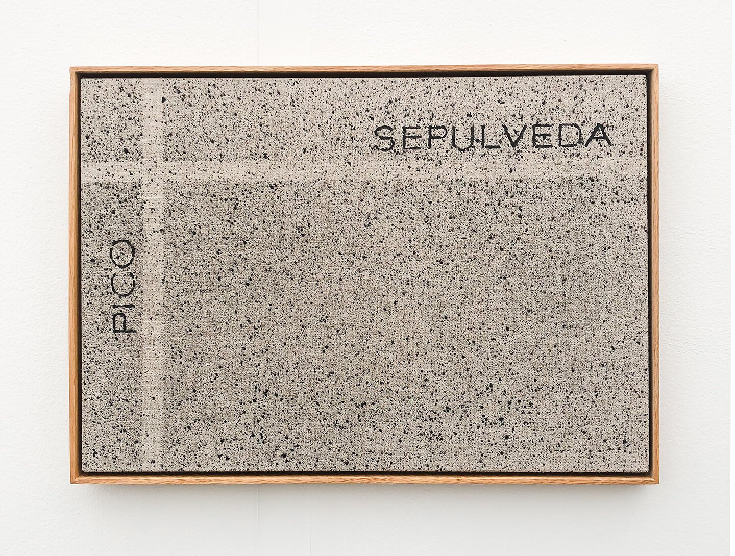
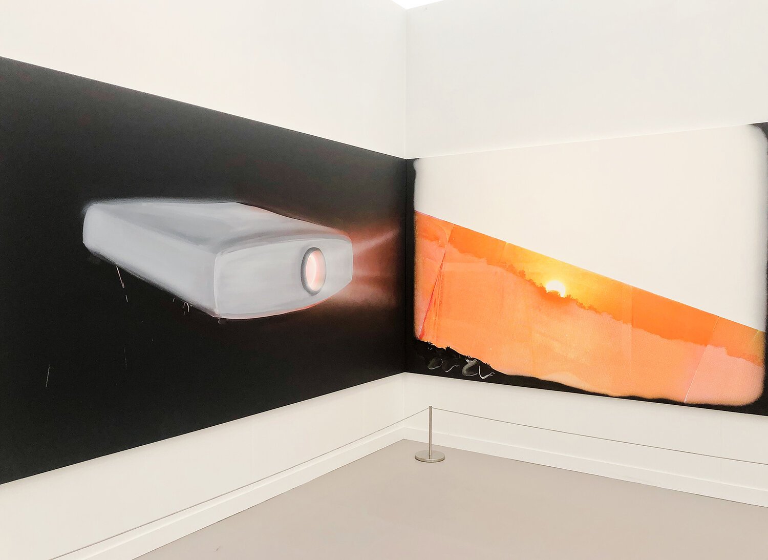
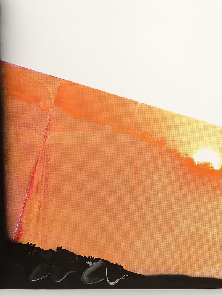
Ed Ruscha Pico & Sepulveda, 2001 at Lévy Gorvy Gallery
Frieze Art Fair
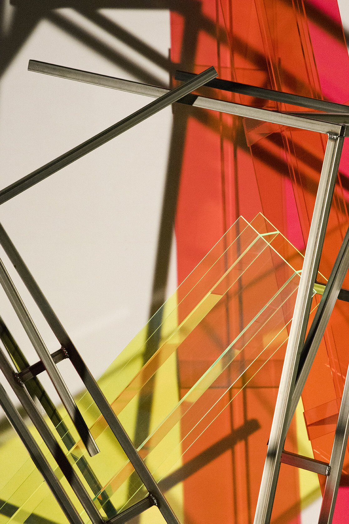
This year Barbara Kasten’s install inside one of the “New York City” backlot buildings was a standout. Apparently it was a first for Kasten to present one of her constructed scenes as sculpture and its scale and theatricality allowed you to feel as if you were stepping into one of her photographs. Seeing her slick, colorful materials juxtaposed by a similarly hodge-podge arrangement of I-beams, wood scaffolding and other “backstage” accoutrement surrounding her installed piece was really fun. Definitely a highlight.
Felix Art Fair
I love hotels so much I used to want to enroll in hotel management school. That was until I realized I liked staying in hotels more than running one - and apparently I also really like viewing art in hotels too, which Felix once again reminded me. Last year the opening was so crowded we couldn’t even get a spot in the elevator to journey to the upstairs rooms, this year we came early on Friday morning and and it was just as well because that was where our three favorite booths were to be found.
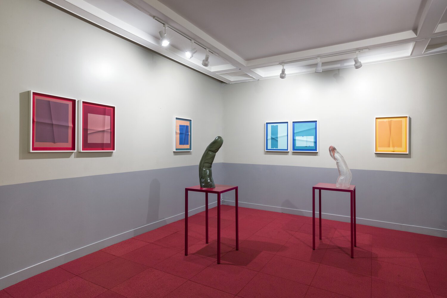
Jessica Silverman
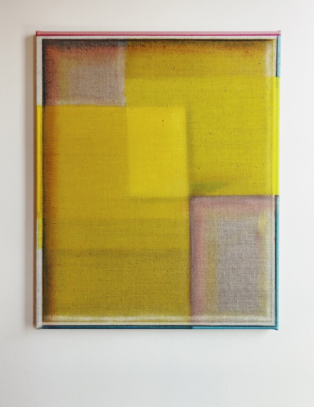
A lovely two-person presentation of long-time favorite John Houck and sculptor Martha Friedman. Houck’s folded photographic pieces create such a fabulous tension between an engagement with the depicted imagery and the physical presence of the printed page. While Friedman’s imposing fingers start to feel like they were the cause of the physical interference we were seeing the outcomes of in Houck’s folded works.
Image courtesy of Jessica Silverman Gallery
Document Space
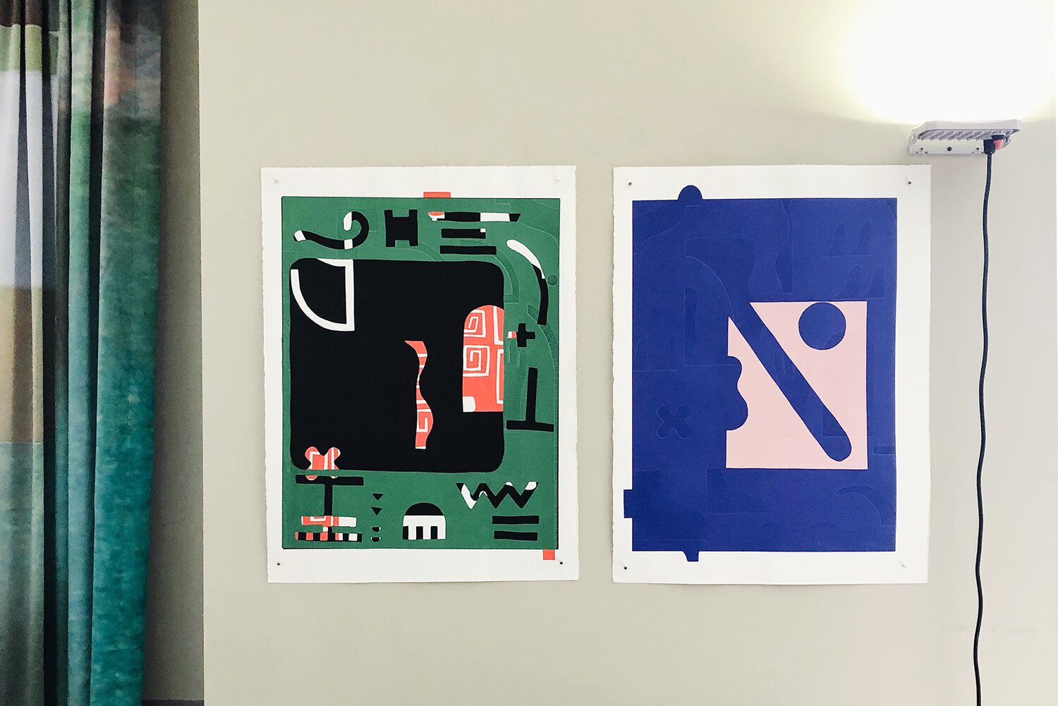
Elizabeth Atterbury monoprints (that she editions with the terrific Wingate Studio) are always worth seeing in person - the blind embossing! Document was also one of only a few galleries that placed pieces in direct reference to the domestic interior with fun Victoria Fu curtain pieces they installed in their suite.
Linn Lühn
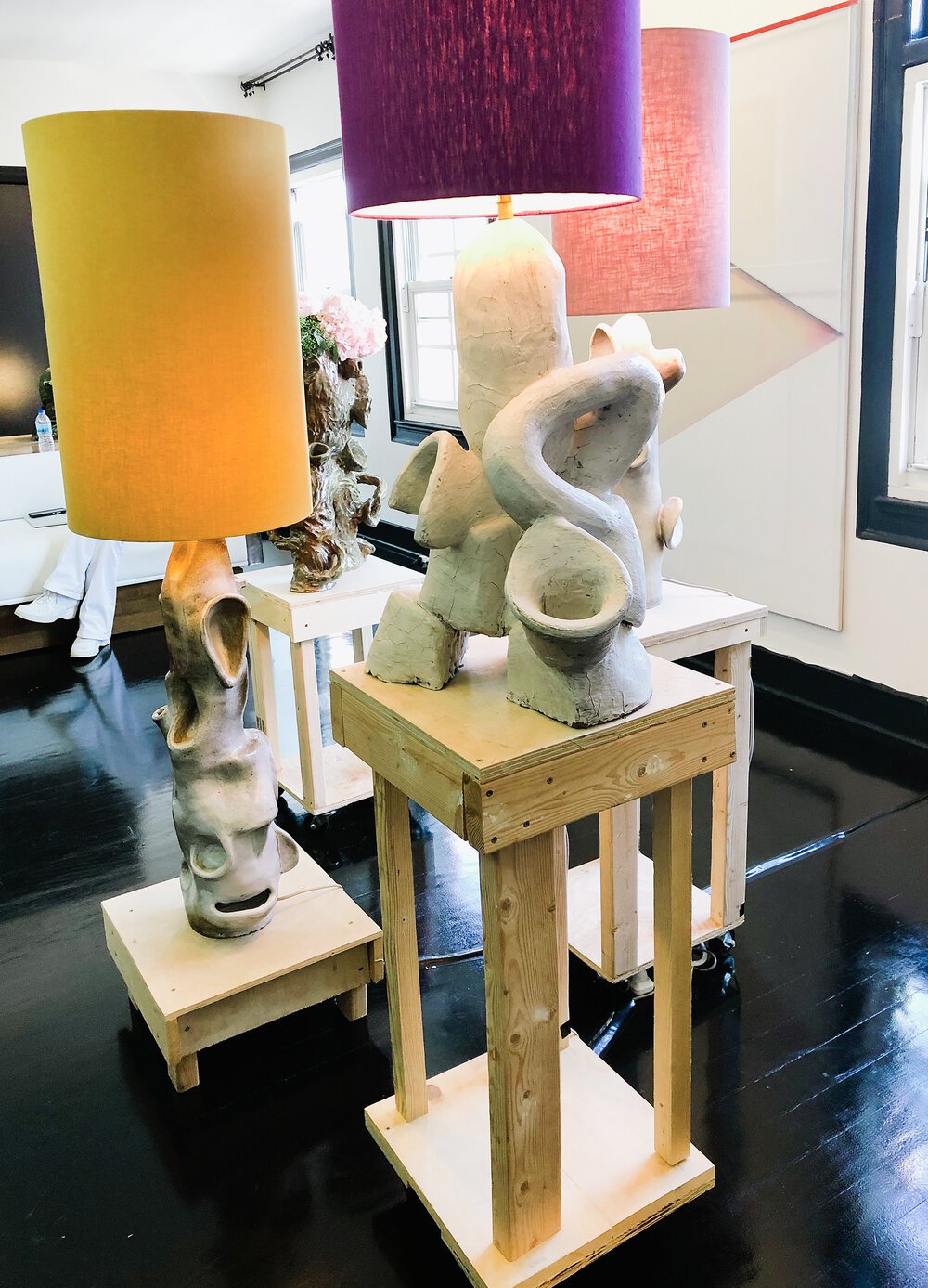
Another terrific two-person presentation that had me thinking this was the way to go in the context of the modestly-sized hotel room spaces - create a dialogue between two of your artists and still have the space to be able to show multiple pieces from each. This time there was a cluster sculptural, ceramic lamps by Carmen d’Apollonio in conversation with gorgeous paintings by Christoph Schellberg.
Around Town
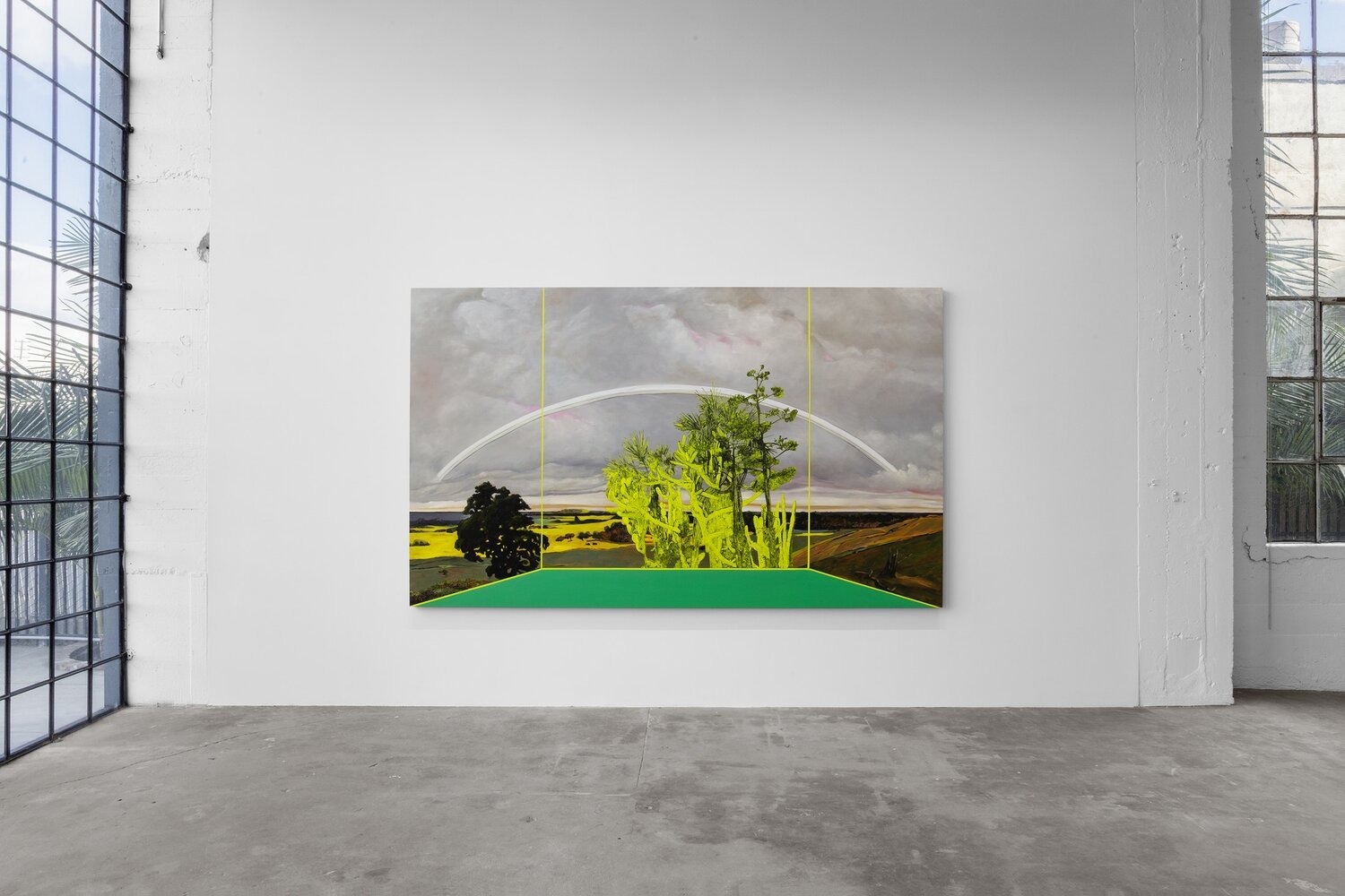
Whitney Bedford at Vielmetter Gallery
To know me is to know I’m very much about representations of landscape and the history around the changing ways it has been depicted through the centuries. Vielmetter’s new space was perfect for a presentation of Bedford’s work as the gallery windows created a lovely doubling of the framing that Bedford employs in her pieces. Her series of paintings, all titled Veduta after the tradition of "view paintings" made for travelers on their world tour in the years before photography, create a interior/exterior dialectic, positioning us as viewers in a separated space from the idealized, classical landscapes rendered in the “outside”.
Image courtesy of Veilmetter Gallery
Nicolas Party at Hauser & Wirth
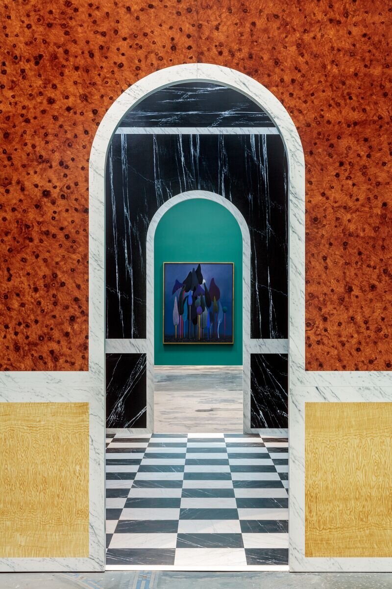
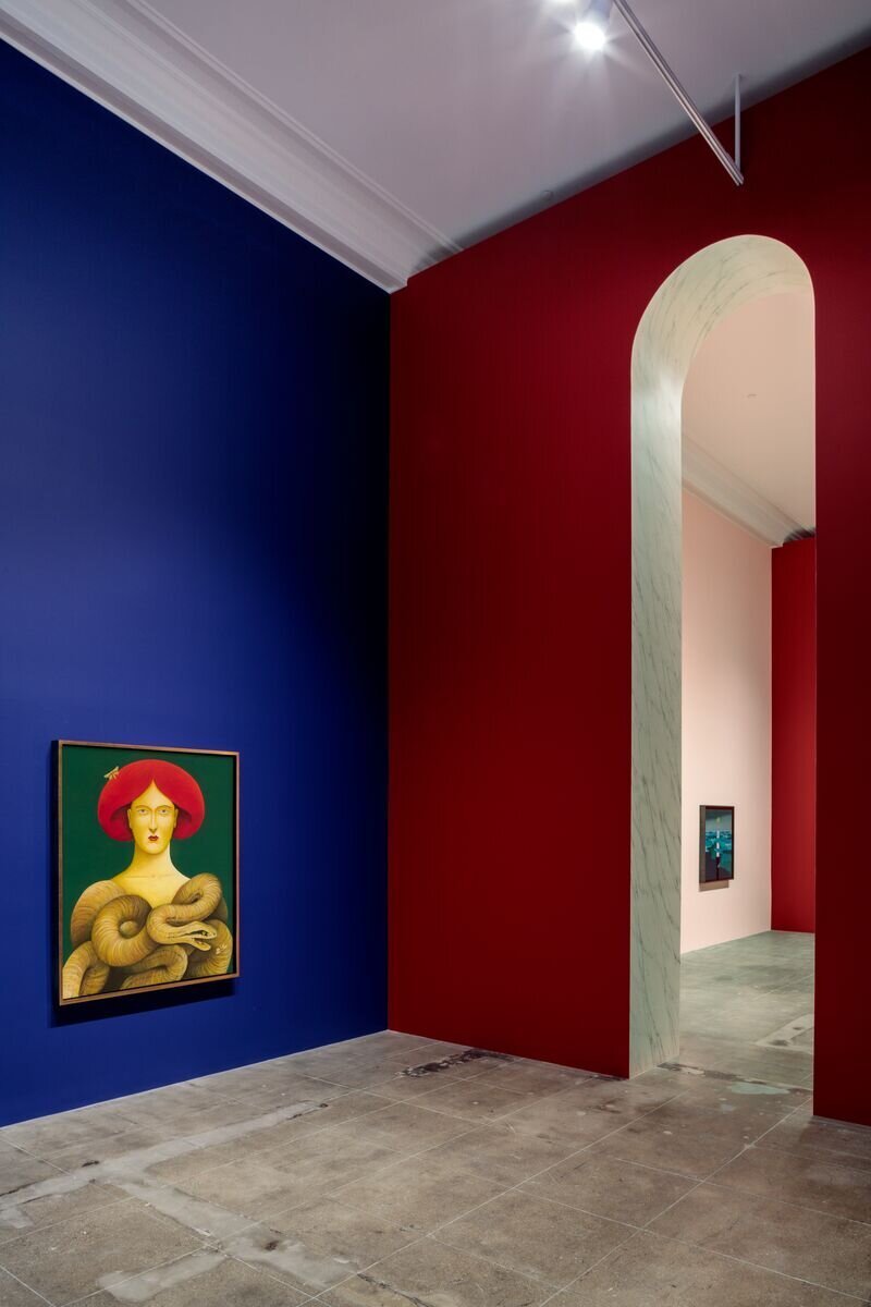
Party is always a crowd pleaser, and this immersive install made wonderful use of the double-height space afforded by Hauser & Wirth’s historic front gallery. Teetering pleasingly between straight-forward set design and expansive fine art fresco it felt like a Hollywood studio moment installed directly inside of the art establishment. Another side note is that I always enjoy how much airtime Party gives (via his terrific Instagram) to the numerous gallery preparators and decorative painters who bring his exhibitions to life. It takes an village of art school grads.
Tishan Hsu at The Hammer Museum
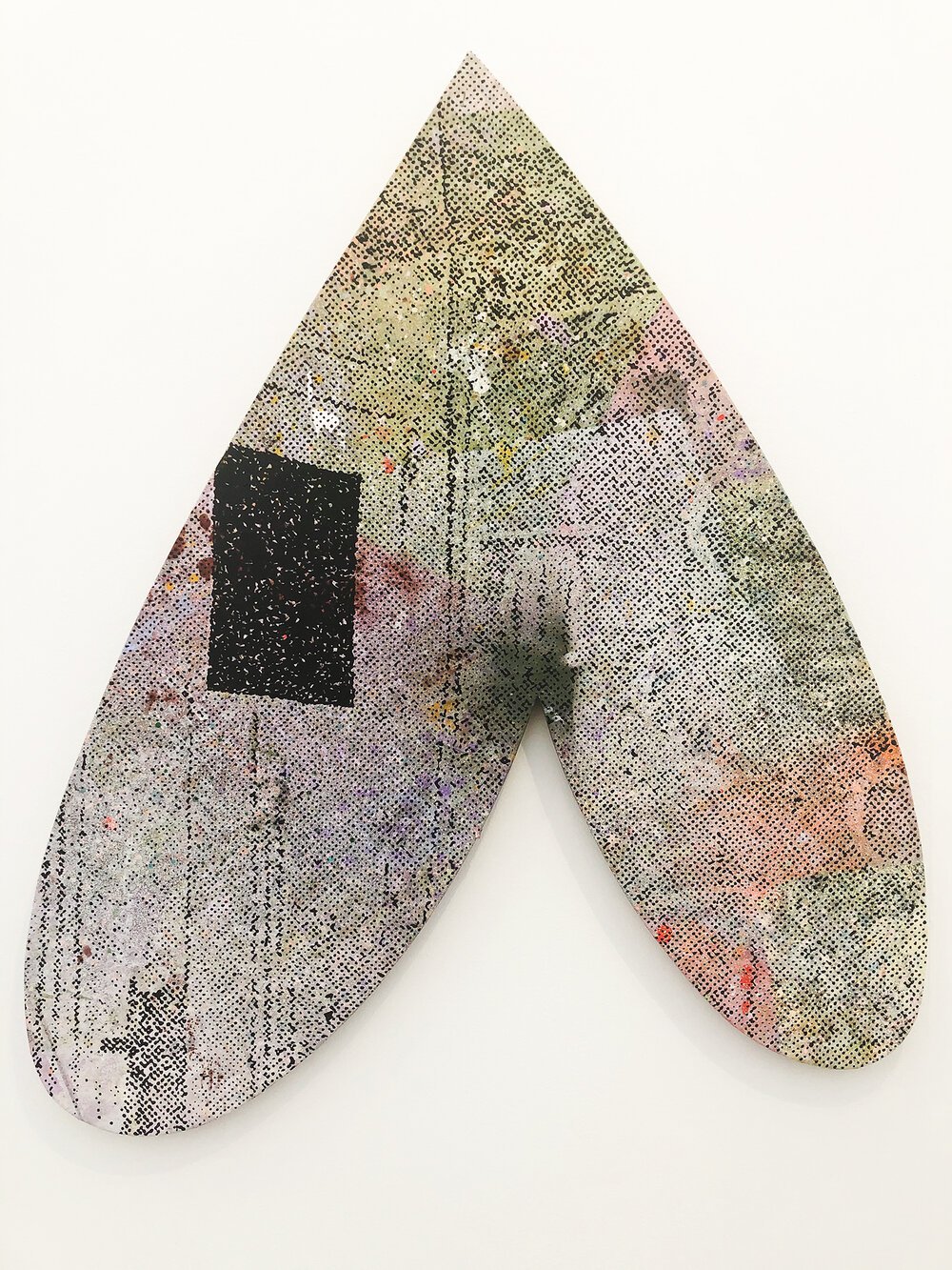
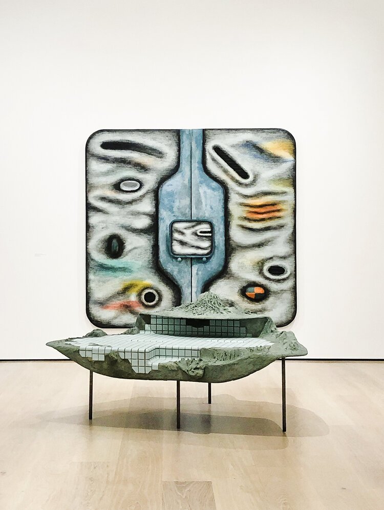
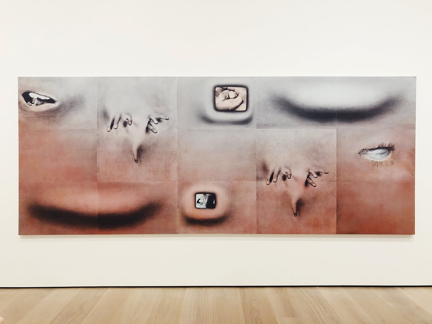
This show reminded me of what joy a complete moment of surprise in the gallery can feel like. Arriving with no expectations, having previously seen none of the work online, or even really recognized the artist’s name prior to viewing meant that moments of discovery throughout the exhibition felt immediate and vivid. There is a New York Times article from last year titled “The World Catches up with Tishan Hsu” and I felt, walking around his show, that I too had a lot of catching up to do. The dates of pieces ranged from 1980 to 2005, but those dates created little interference with the feeling that the work really lives outside of time and could have been made yesterday…or in 20 years time. The combination of other worldly/pseudo sci-fi forms, met with impeccable craftsmanship and consideration of material was so, so satisfying to view.

