Printing Our Jerry Birchfield Edition
Photos of constructed surfaces and sculptural pieces. Objects in consult with photo emulsion and captured in the enlarger’s light. Photo prints encased in plaster and presented as sculptural works. Arrangements of free-standing and wall-mounted pieces that prompt a very specific and purposeful visual interplay.

We first met the Cleveland-based artist Jerry Birchfield at grad school when we were both completing our MFA at Cornell. I had worked alongside a few photographers at that point but once I saw Jerry building custom, multi-level wooden frame/sculptures to present his photographs for exhibition, I could tell there was a breadth of material concern in his work that I would only fully understand over the course of the proceeding years.
There is a level of concern Jerry gives to his installation choices and exhibition design that ensure even when his photographs recall surfaces of architectural debris or fragments of studio cast-offs, the viewer is primarily attuned to the careful craft at play in how his imagery has been constructed and what decisions have been made about its display.
“Birchfield calls attention to the gap between his photographs’ original subjects and the abstracted printed image that you see. The resulting gelatin silver prints are complemented by wall relief sculptures that assert the physical nature of printed photographs. By encasing photographs in plaster, Birchfield masks the images and warps the paper upon which they exist.”
– (Douglas Max Utter in his review of Birchfield’s exhibition Asleep in the Dust at the Akron Art Museum via Can Journal)
Our enthusiasm for working on a printed edition with Jerry was in large part due to his ongoing concern with how the space between two and three dimensions can be mined. Many of his pieces offer a textural accounting of some unknown passage of time or moment of destruction and we relished the possibility that our screenprinting process of slow, layered application of inks would feel akin to a rebuilding.
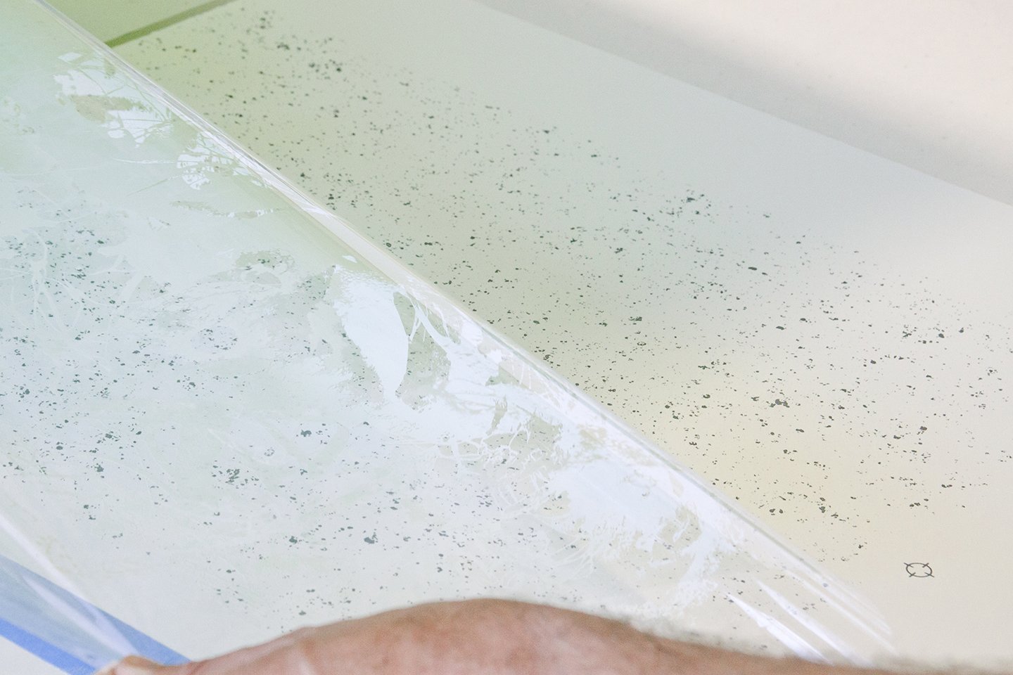
The methods through which we reconstructed the layers of grey tones and almost-blacks weren’t typical of a photo reproduction process via screenprint as we largely eschewed the use of halftone to achieve greyscale. We also wanted to make a material reference to the metallic tones of the silver gelatin photos prints by incorporating a large amount of pearlescent and metallic pigments into our inks and adding areas of spot gloss overlay.
An additional nod to our source material are the scale of the three prints (16” x 20”), typical of the photo papers that Jerry often utilizes in his photograms and prints. Our aim was for the trio of screenprints to behave less like faithful reproductions and more explorations of how Jerry’s particular methods of image construction could inspire our own decisions and processes.